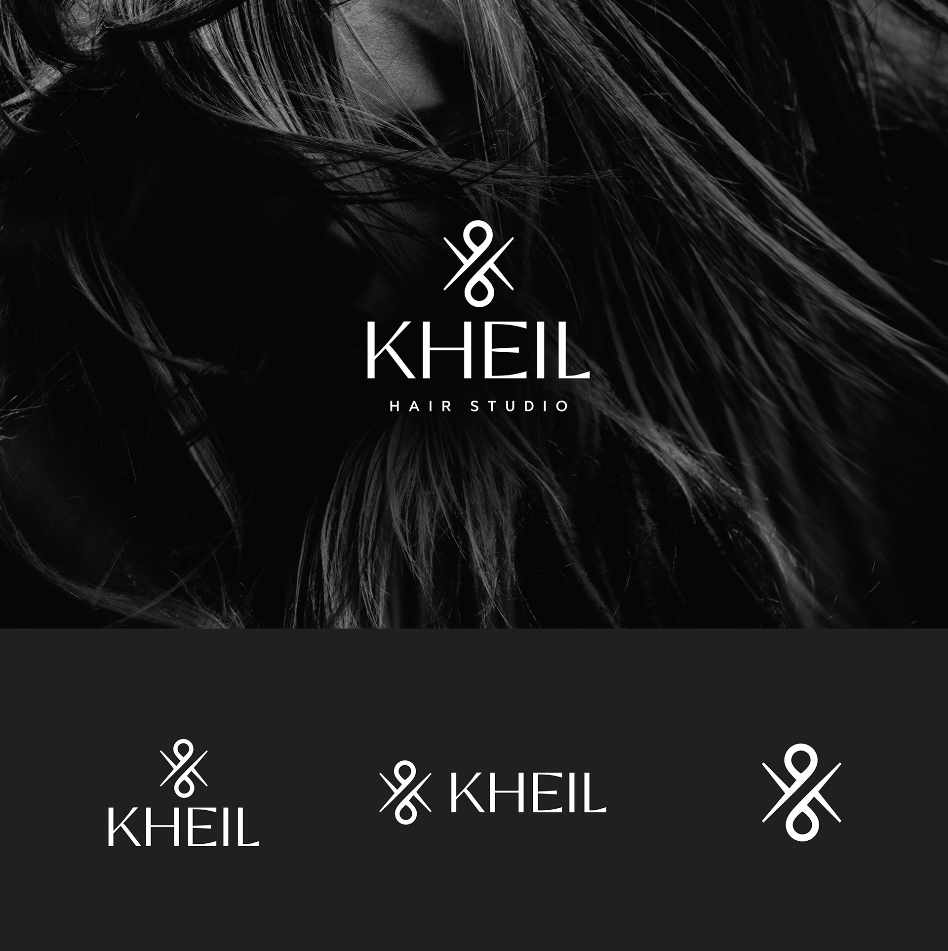
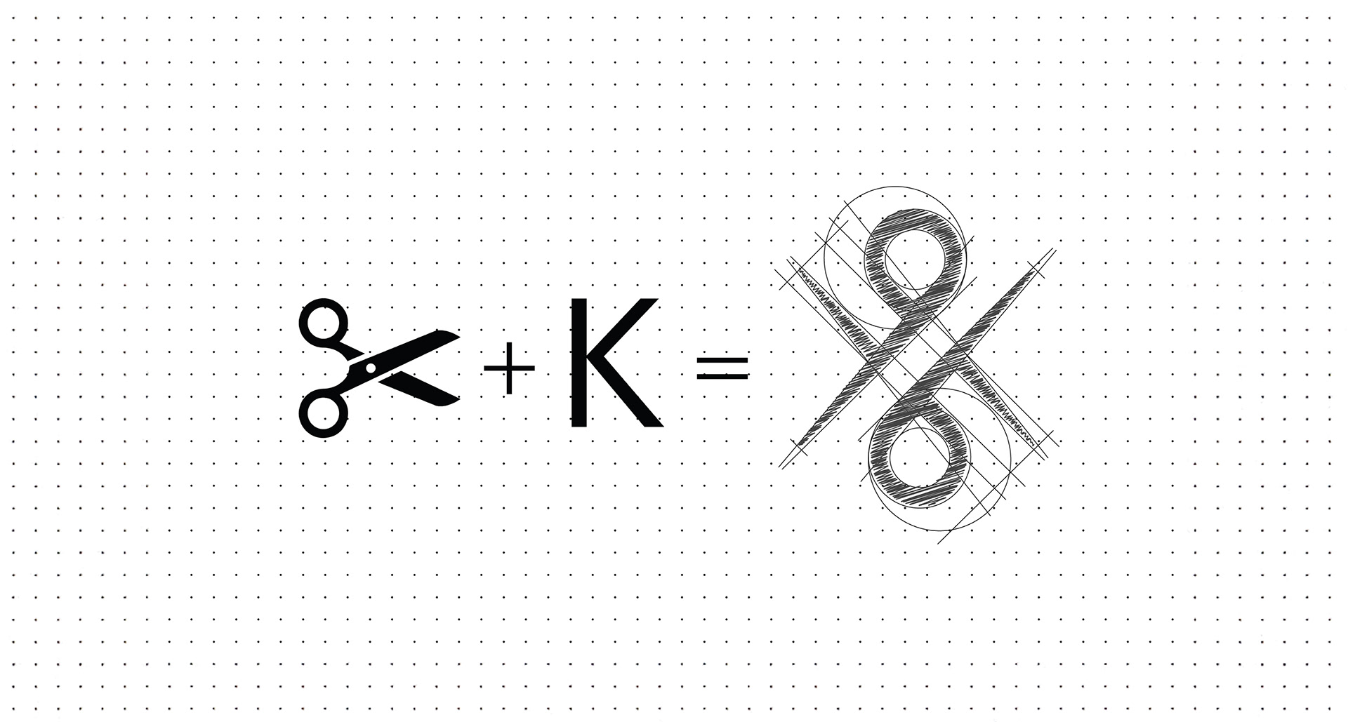
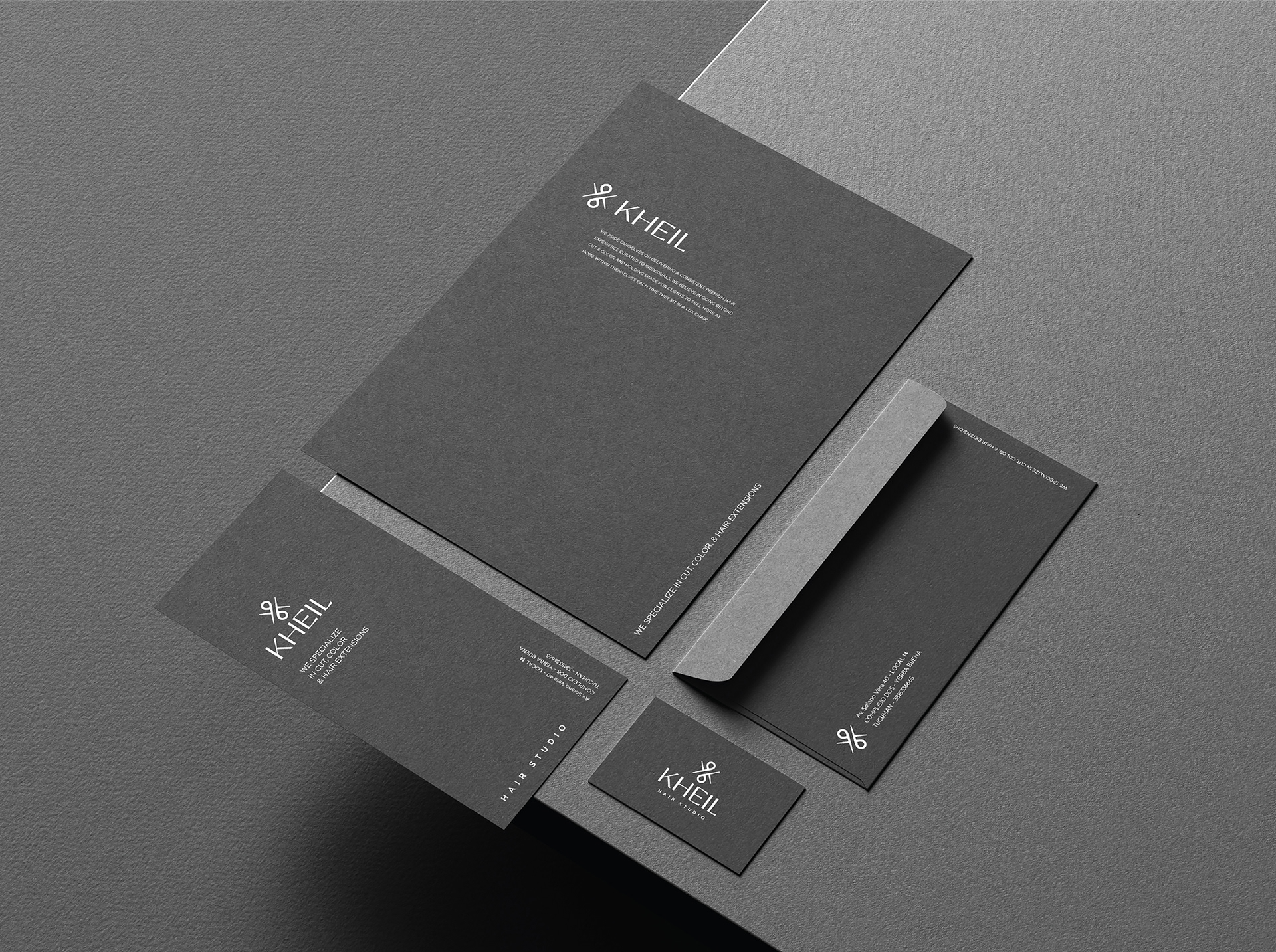
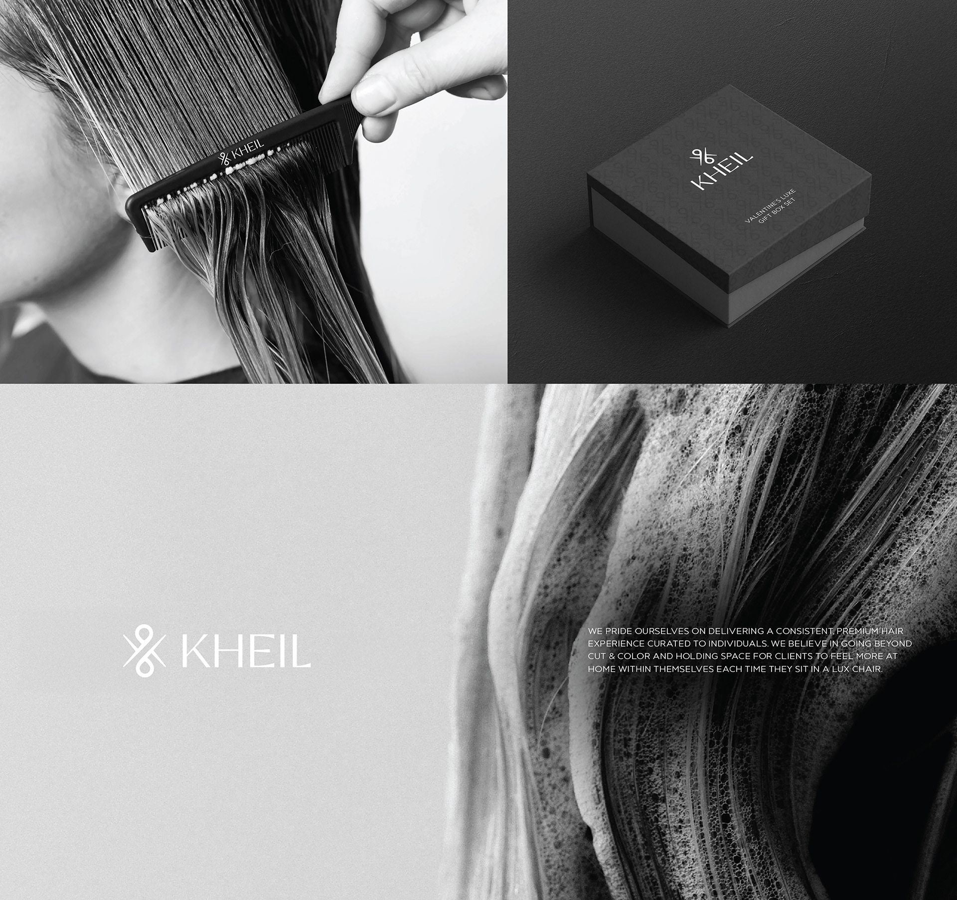
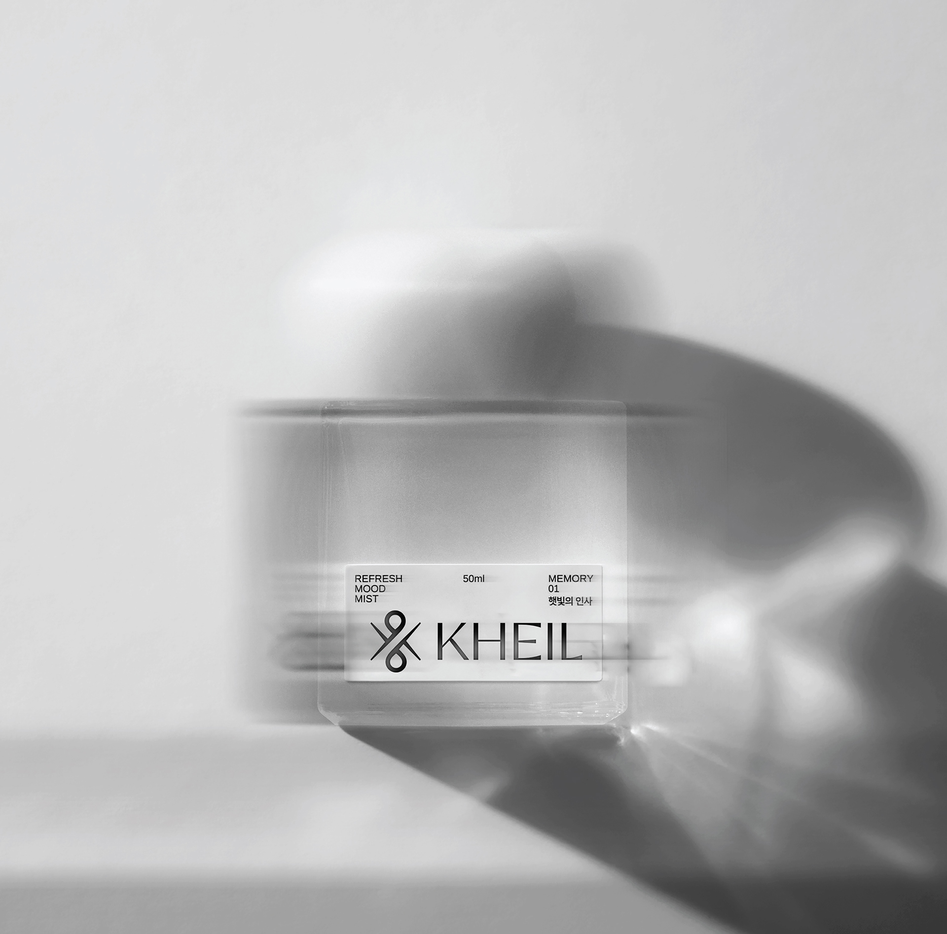
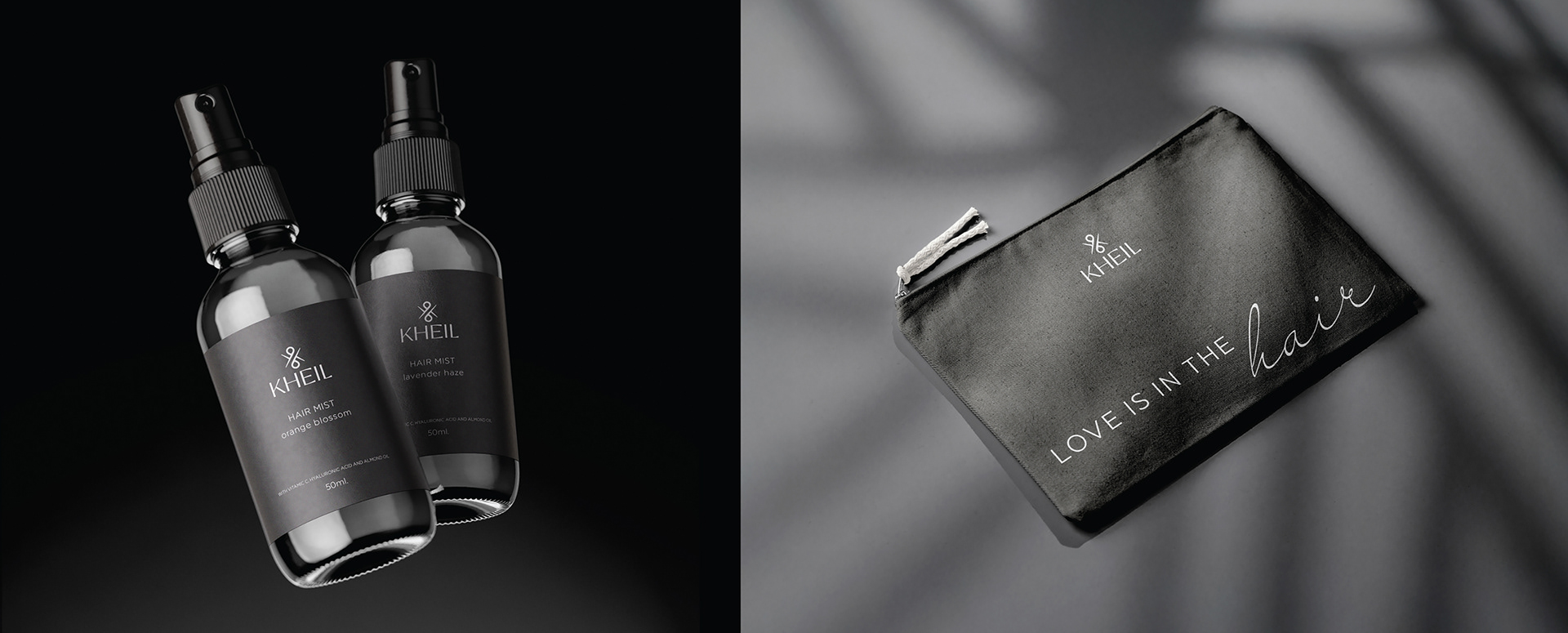
A sophisticated brand identity designed for a premium hair studio focused on precision, craftsmanship, and an elevated client experience. The visual concept is built around a distinctive symbol derived from the combination of scissors and the letter “K”, creating a unique and memorable mark that reflects both function and identity.
The design direction embraces a minimal and refined aesthetic, using a monochromatic palette and strong typography to convey elegance, confidence, and modernity. This restrained approach allows the brand to stand out through subtle details and high-end execution.
The identity system was applied across a range of touchpoints, including stationery, packaging, and product design, ensuring a cohesive and immersive brand experience. Editorial-style imagery and art direction further reinforce the brand’s positioning within the luxury beauty space.
The result is a timeless and versatile identity that elevates the perception of the studio while maintaining clarity and visual impact.